Consider you are a data scientist at a large bank, and your CDO has instructed you to develop a means of automating bank loan decisions. You decide that this should be a binary classifier and proceed to collect several hundred data points. But what kind of model should you start off and what sort of feature engineering should you complete? Why not screen multiple combinations?
This project will use the loan prediction data set to exemplify the use of workflow_sets() within the Tidymodels machine learning ecosystem. Screening a series of models and feature engineering pipelines are important to avoid any internal bias towards a particular model type, or the "No Free Lunch" theorem. If you’re interested in learning more about the Tidymodels ecosystem before reading, please check out my previous article.
Loan Prediction Data has been taken from https://datahack.analyticsvidhya.com/contest/practice-problem-loan-prediction-iii/.

Load Packages and Data
library(tidymodels) #ML meta packages
library(themis) #Recipe functions to deal with class imbalances
library(discrim) #Naive Bayes Models
library(tidyposterior) #Bayesian Performance Comparison
library(corrr) #Correlation Viz
library(readr) #Read Tabular Data
library(magrittr) #Pipe Operators
library(stringr) #Work with Strings
library(forcats) #Work with Factors
library(skimr) #Data Summary
library(patchwork) #ggplot grids
library(GGally) #Scatterplot Matrices
train <- read_csv("train_ctrUa4K.csv")train %<>% rename(Applicant_Income = ApplicantIncome,
CoApplicant_Income = CoapplicantIncome,
Loan_Amount = LoanAmount)
Exploratory Data Analysis
Before we start screening models, complete our due diligence with some basic exploratory data analysis.
We use the skimr package to produce the below output
skim(train)
Furthermore, we can visualise these results with appropriate visualisations using the following function.
#Automated Exploratory Data Analysis
viz_by_dtype <- function (x,y) {
  title <- str_replace_all(y,"_"," ") %>%
           str_to_title()
  if ("factor" %in% class(x)) {
    ggplot(train, aes(x, fill = x)) +
      geom_bar() +
      theme(legend.position = "none",
            axis.text.x = element_text(angle = 45, hjust = 1),
            axis.text = element_text(size = 8)) +
      theme_minimal() +
      scale_fill_viridis_c()+
      labs(title = title, y = "", x = "")
  }
  else if ("numeric" %in% class(x)) {
    ggplot(train, aes(x)) +
      geom_histogram()  +
      theme_minimal() +
      scale_fill_viridis_c()+
      labs(title = title, y = "", x = "")
  }
  else if ("integer" %in% class(x)) {
    ggplot(train, aes(x)) +
      geom_histogram() +
      theme_minimal() +
      scale_fill_viridis_c()+
      labs(title = title, y = "", x = "")
  }
  else if ("character" %in% class(x)) {
    ggplot(train, aes(x, fill = x)) +
      geom_bar() +
      theme_minimal() +
      scale_fill_viridis_d()+
      theme(legend.position = "none",
            axis.text.x = element_text(angle = 45, hjust = 1),
            axis.text = element_text(size = 8)) +
      labs(title = title, y  ="", x= "")
  }
}
variable_plot <- map2(train, colnames(train), viz_by_dtype) %>%
wrap_plots(ncol = 3,
nrow = 5)
- Gender imbalance, high proportion of male applicants, with NAs present
- Marital Status, almost 3:2 married applicants to unmarried, with NAs present
- Majority of applicants do not have children
- Majority of applicants are university graduates
- Majority are not self-employed
- Applicant Income is right skewed
- Co-applicant Income is right skewed
- Loan Amount is right skewed
- Loan Amount Term is generally 360 days
- Majority of applicants have a credit history, with NAs present
- Mix of Property Area Types
- Majority of applications had their application approved, target variable Loan Status is imbalanced 3:2
Bivariate Data Analysis
Quantitative Variables
Using GGally::ggpairs(), we generate a variable matrix plot for all numeric variables and coloured by Loan_Status.
#Correlation Matrix Plot
ggpairs(train %>% select(7:10,13), ggplot2::aes(color = Loan_Status, alpha = 0.3)) +
  theme_minimal() +
  scale_fill_viridis_d(aesthetics = c("color", "fill"), begin = 0.15, end = 0.85) +
  labs(title = "Numeric Bivariate Analysis of Loan Data")
Qualitative Variables
The below visualisation was generated iteratively using a summary dataframe generated as below, changing the desired character variable.
#Generate Summary Variables for Qualitative Variables
summary_train <-
  train %>%
  select(where(is.character),
         -Loan_ID) %>%
  drop_na() %>%
  mutate(Loan_Status = if_else(Loan_Status == "Y",1,0)) %>%
  pivot_longer(1:6, names_to = "Variables", values_to = "Values") %>%
  group_by(Variables, Values) %>%
    summarise(mean = mean(Loan_Status),
              conf_int = 1.96*sd(Loan_Status)/sqrt(n())) %>%
  pivot_wider(names_from = Variables, values_from = Values)
summary_train %>% select(Married, mean, conf_int) %>%
drop_na() %>%
ggplot(aes(x=Married, y = mean, color = Married)) +
geom_point() +
geom_errorbar(aes(ymin = mean - conf_int, ymax = mean + conf_int), width = 0.1) +
theme_minimal() +
theme(legend.position = "none",
axis.title.x = element_blank(),
axis.title.y = element_blank()) +
scale_colour_viridis_d(aesthetics = c("color", "fill"), begin = 0.15, end = 0.85) +
labs(title="Married")
The benefit of having completed a visualisation as above is that it gives an understanding of the magnitude of difference of loan application success as well as the uncertainty, visualised by the 95% confidence intervals for each categorical variable. From this we note the following:
- Married applicants tend to have a greater chance of their application being approved.
- Graduate applicants have a greater chance of success, maybe because of more stable/higher incomes.
- Similarly, there is far greater variation in the success of applicants who work for themselves, likely because of variation in income stability
- Number of children doesn’t appear to have a great impact on loan status
- Female customers have a much greater variability in the success of the application, male customers is more discrete. We need to be careful of this so as to not create ingrained bias’ in the algorithm.
- Semiurban, or Suburban has the highest success proportion.
- Lastly, there is a significant difference in success rates between customers with and without a Credit History.
If we wanted to, we could explore these relationships further with ANOVA/Chi Squared testing.
Data Splitting – rsamples
We’ve split the data 80:20, stratified by Loan_Status. Each split tibble can be accessed by calling training() or testing() on the mc_split object.
#Split Data for Testing and Training
set.seed(101)
loan_split <- initial_split(train, prop = 0.8, strata = Loan_Status)
Model Development – parsnip.
As noted above, we want to screen an array of models and hone in on a couple that would be good candidates. Below we’ve initialised a series of standard Classification models.
#Initialise Seven Models for Screening
nb_loan <-
  naive_Bayes(smoothness = tune(), Laplace = tune()) %>%
  set_engine("klaR") %>%
  set_mode("classification")
logistic_loan <-
logistic_reg(penalty = tune(), mixture = tune()) %>%
set_engine("glmnet") %>%
set_mode("classification")dt_loan <- decision_tree(cost_complexity = tune(), tree_depth = tune(), min_n = tune()) %>%
set_engine("rpart") %>%
set_mode("classification")rf_loan <-
rand_forest(mtry = tune(), trees = tune(), min_n = tune()) %>%
set_engine("ranger") %>%
set_mode("classification")knn_loan <- nearest_neighbor(neighbors = tune(), weight_func = tune(), dist_power = tune()) %>%
set_engine("kknn") %>%
set_mode("classification")svm_loan <-
svm_rbf(cost = tune(), rbf_sigma = tune(), margin = tune()) %>%
set_engine("kernlab") %>%
set_mode("classification")xgboost_loan <- boost_tree(mtry = tune(), trees = tune(), min_n = tune(), tree_depth = tune(), learn_rate = tune(), loss_reduction = tune(), sample_size = tune()) %>%
set_engine("xgboost") %>%
set_mode("classification")Feature Engineering – recipes
The below is a series of recipe configurations. How will the two different imputation methods compare against one and other, in the below note we’ve used impute_mean (for numeric), impute_mode (for character) or use impute_bag (imputation using bagged trees) which can impute both numeric and character variables.
Note with Credit_History we’ve elected not to impute this value, instead, allocated three results to an integer value, setting unknown instances to 0.
As Loan_Status is imbalanced, we’ve applied SMOTE (Synthetic Minority Overs-Sampling Technique) to recipe 2 and 4. We’ll complete workflow comparison to understand any difference in accuracy between the imputation strategies.
#Initialise Four Recipes
recipe_1 <-
  recipe(Loan_Status ~., data = training(loan_split)) %>%
  step_rm(Loan_ID) %>%
  step_mutate(Credit_History = if_else(Credit_History == 1, 1, -1,0)) %>%
  step_scale(all_numeric_predictors(), -Credit_History) %>%
  step_impute_bag(Gender,
                  Married,
                  Dependents,
                  Self_Employed,
                  Loan_Amount,
                  Loan_Amount_Term) %>%
  step_dummy(all_nominal_predictors())
recipe_2 <-
recipe(Loan_Status ~., data = training(loan_split)) %>%
step_rm(Loan_ID) %>%
step_mutate(Credit_History = if_else(Credit_History == 1, 1, -1,0)) %>%
step_scale(all_numeric_predictors(), -Credit_History) %>%
step_impute_bag(Gender,
Married,
Dependents,
Self_Employed,
Loan_Amount,
Loan_Amount_Term) %>%
step_dummy(all_nominal_predictors()) %>%
step_smote(Loan_Status)
recipe_3 <-
recipe(Loan_Status ~., data = training(loan_split)) %>%
step_rm(Loan_ID) %>%
step_mutate(Credit_History = if_else(Credit_History == 1, 1, -1,0)) %>%
step_scale(all_numeric_predictors(), -Credit_History) %>%
step_impute_mean(all_numeric_predictors()) %>%
step_impute_mode(all_nominal_predictors()) %>%
step_dummy(all_nominal_predictors()) %>%
step_zv(all_predictors())recipe_4 <-
recipe(Loan_Status ~., data = training(loan_split)) %>%
step_rm(Loan_ID) %>%
step_mutate(Credit_History = if_else(Credit_History == 1, 1, -1,0)) %>%
step_scale(all_numeric_predictors(), -Credit_History) %>%
step_impute_mean(all_numeric_predictors()) %>%
step_impute_mode(all_nominal_predictors()) %>%
step_dummy(all_nominal_predictors()) %>%
step_zv(all_predictors()) %>%
step_smote(Loan_Status)Taking recipe_1, we can prepare both the training and test datasets per the transformations.
#Prep and Bake Training and Test Datasets
loan_train <- recipe_1 %>% prep() %>% bake(new_data = NULL)
loan_test <- recipe_1 %>% prep() %>% bake(testing(loan_split))
Then take these transformed datasets and visualise variable correlation.
#Generate Correlation Visualisation
loan_train %>% bind_rows(loan_test) %>%
  mutate(Loan_Status = if_else(Loan_Status == "Y",1,0)) %>%
              correlate() %>%
              rearrange() %>%
              shave() %>%
              rplot(print_cor = T,.order = "alphabet") +
                theme_minimal() +
                theme(axis.text.x = element_text(angle = 90)) +
                scale_color_viridis_c() +
                labs(title = "Correlation Plot for Trained Loan Dataset")
From the above we note a strong relationship between Loan_Status and whether an applicant has a Credit_History. This makes sense, bank’s are more inclined to give loans to customers with a credit history, evidence positive or otherwise of a customers ability to repay the loan.
Iterating Parnsip and Recipe Combinations – Workflow Sets
Workflow Sets enables us to screen all possible combinations of recipe and parnsip model specifications. As below, we’ve created two named lists, all models and recipes.
#Generate List of Recipes
recipe_list <-
list(Recipe1 = recipe_1, Recipe2 = recipe_2, Recipe3 = recipe_3, Recipe4 = recipe_4)
#Generate List of Model Types
model_list <-
list(Random_Forest = rf_loan, SVM = svm_loan, Naive_Bayes = nb_loan, Decision_Tree = dt_loan, Boosted_Trees = xgboost_loan, KNN = knn_loan, Logistic_Regression = logistic_loan)Here comes the fun part, creating a series of workflows using workflow_sets()
model_set <- workflow_set(preproc = recipe_list, models = model_list, cross = T)Setting cross = T instructs workflow_set to create all possible combinations of parsnip model and recipe specification.
set.seed(2)
train_resamples <- bootstraps(training(loan_split), strata = Loan_Status)
doParallel::registerDoParallel(cores = 12)
all_workflows <-
model_set %>% workflow_map(resamples = train_resamples,
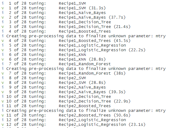
verbose = TRUE)We’ve initialised a boostraps resampling procedure, this is computationally more demanding, however results in less error overall. Passing the model_set object through to workflow_map, with the resampling procedure will initate a screen of all parsnip-recipe combinations showing an output like this. This is a demanding procedure, and hence why we’ve initiated parrallel compute to ease this along.
Using the resampling procedure, workflow_map will fit each workflow to the training data and compute accuracy on each resample and take the mean. Furthermore, as each of the recipes specifies that the hyperparameters should be tuned, workflow_map will perform some tuning to provide an optimal result.
Once completed, we can call the all_workflows object and collect all the metrics that were calculated in this procedure, and visualise the results.
N.B there is an autoplot() function available for workflow_set objects, however we want to be able to compare recipe and model performance so have had to re-engineer features for visualisation below.
#Visualise Performance Comparison of Workflows
collect_metrics(all_workflows) %>%
  separate(wflow_id, into = c("Recipe", "Model_Type"), sep = "_", remove = F, extra = "merge") %>%
  filter(.metric == "accuracy") %>%
  group_by(wflow_id) %>%
  filter(mean == max(mean)) %>%
  group_by(model) %>%
  select(-.config) %>%
  distinct() %>%
  ungroup() %>%
  mutate(Workflow_Rank =  row_number(-mean),
         .metric = str_to_upper(.metric)) %>%
  ggplot(aes(x=Workflow_Rank, y = mean, shape = Recipe, color = Model_Type)) +
    geom_point() +
    geom_errorbar(aes(ymin = mean-std_err, ymax = mean+std_err)) +
    theme_minimal()+
    scale_colour_viridis_d() +
    labs(title = "Performance Comparison of Workflow Sets", x = "Workflow Rank", y = "Accuracy", color = "Model Types", shape = "Recipes")
From the above we can observe:
- Naive Bayes and KNN models have performed the worst
- Tree-Based methods have performed very well
- SMOTE has not offered an increase in performance for more complex model types, no change between recipes for decision tree model.
Whilst we’ve made very general first glance observations, given the slight difference in the mean accuracy of say the top 8 workflows, how do we discern which are distinct, or otherwise practically the same?
Post Hoc Analysis of Resampling – tidyposterior
One way to compare models is to examine the resampling results, and ask are the models actually different? The tidyposterior::perf_mod function enables comparisons of all of our workflow combinations by generating a set of posterior distributions, for a given metric, which can then be compared against each other for practical equivalence. Essentially, we can make between-workflow comparisons.
doParallel::registerDoParallel(cores = 12)
set.seed(246)
acc_model_eval <- perf_mod(all_workflows, metric = "accuracy", iter = 5000)
The results of perf_mod are then passed to tidy() to extract the underlying findings of the posterior analysis. Their distributions are visualised below.
#Extract Results from Posterior Analysis and Visualise Distributions
acc_model_eval %>%
  tidy() %>%
  mutate(model = fct_inorder(model)) %>%
  ggplot(aes(x=posterior)) +
   geom_histogram(bins = 50) +
   theme_minimal() +
   facet_wrap(~model, nrow = 7, ncol = 6) +
   labs(title = "Comparison of Posterior Distributions of Model Recipe Combinations", x = expression(paste("Posterior for Mean Accuracy")), y = "")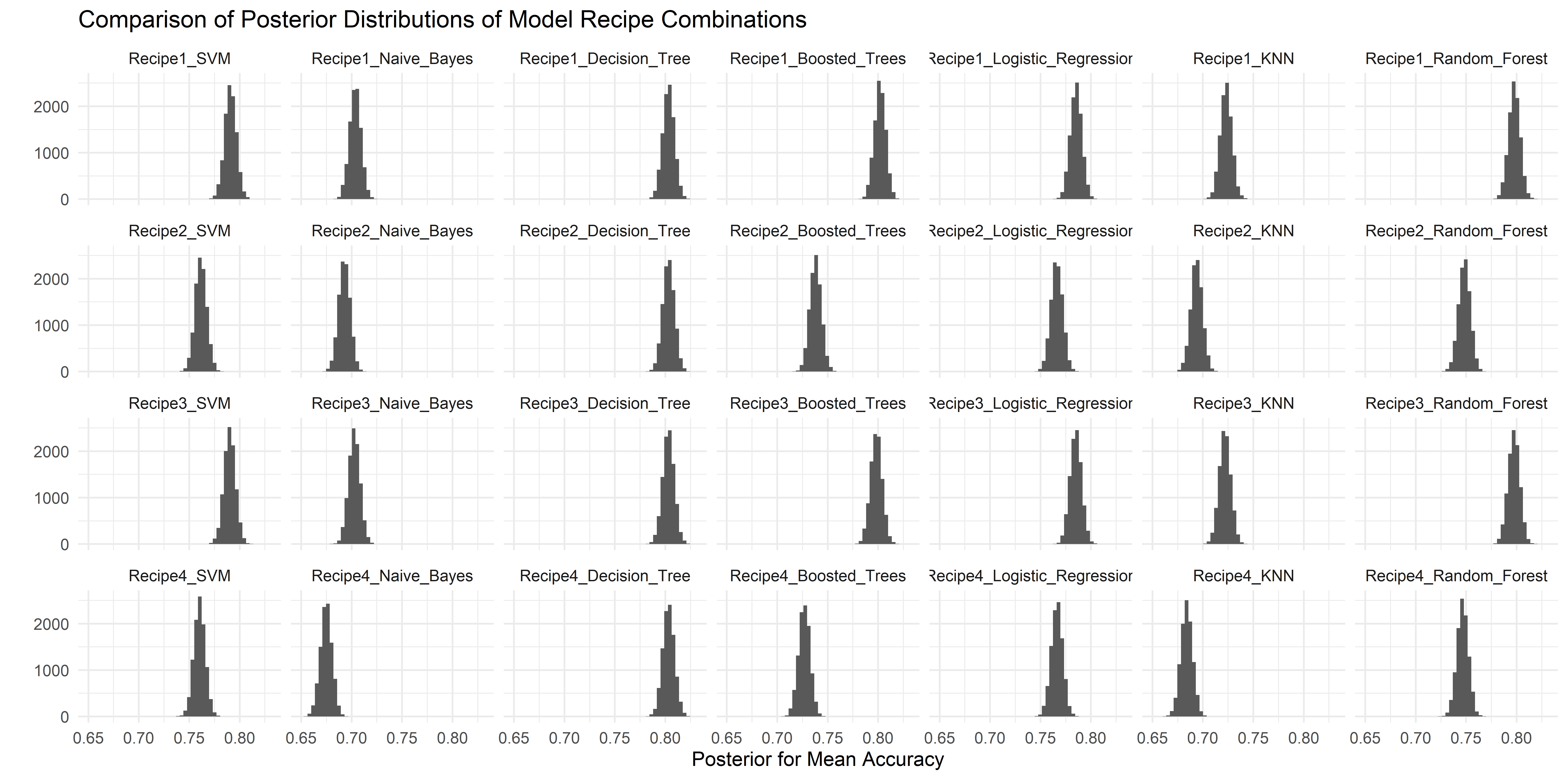
Looking back at our performance comparison, we observe that the two highest rank models are Boosted Trees and Decision Trees with Recipe1, models on the extreme sides of the interpretability scale for tree based models. We can seek to understand further by taking the difference in means of their respective posterior distributions.
Using contrast_models() we can conduct that analysis.
#Compare Two Models - Difference in Means
mod_compare <- contrast_models(acc_model_eval,
                            list_1 = "Recipe1_Decision_Tree",
                            list_2 = "Recipe1_Boosted_Trees")
a1 <- mod_compare %>%
as_tibble() %>%
ggplot(aes(x=difference)) +
geom_histogram(bins = 50, col = "white", fill = "#73D055FF")+
geom_vline(xintercept = 0, lty = 2) +
theme_minimal()+
scale_fill_viridis_b()+
labs(x= "Posterior for Mean Difference in Accuracy", y="", title = "Posterior Mean Difference Recipe1_Decision_Tree & Recipe3_Boosted_Trees")a2 <- acc_model_eval %>%
tidy() %>% mutate(model = fct_inorder(model)) %>%
filter(model %in% c("Recipe1_Boosted_Trees", "Recipe1_Decision_Tree")) %>%
ggplot(aes(x=posterior)) +
geom_histogram(bins = 50, col = "white", fill = "#73D055FF") +
theme_minimal()+
scale_colour_viridis_b() +
facet_wrap(~model, nrow = 2, ncol = 1) +
labs(title = "Comparison of Posterior Distributions of Model Recipe Combinations", x = expression(paste("Posterior for Mean Accuracy")), y = "")a2/a1
Piping the mod_compare object to summary generates the following output
mod_compare %>% summary()
mean
0.001371989 #Difference in means between posterior distributions
probability
0.5842 #Proportion of Posterior of Mean Difference > 0
As also evidenced by the posterior for mean difference, the mean difference is small between the respective workflow posterior distributions for mean accuracy. 58.4% of the posterior difference of means distribution is above 0, so we can infer that the positive difference is real (albeit slight).
We can investigate further, with the notion of practical equivalence.
summary(mod_compare, size = 0.02)
pract_equiv
0.9975
The effect size are thresholds on both sides [-0.02, 0.02] of the difference in means posterior distribution, and the pract_equiv measures how much of the diff. in means post. distribution is within these thresholds. For our comparison, Boosted_Trees is 99.75% within the posterior distribution for Decision_Tree.
We can complete this exercise for all workflows as below.
#Pluck and modify underlying tibble from autoplot()
autoplot(acc_model_eval, type = "ROPE", size = 0.02) %>%
  pluck("data") %>%
  mutate(rank = row_number(-pract_equiv)) %>%
  arrange(rank) %>%
  separate(model, into = c("Recipe", "Model_Type"), sep = "_", remove = F, extra = "merge") %>%
  ggplot(aes(x=rank, y= pract_equiv, color = Model_Type, shape = Recipe)) +
   geom_point(size = 5) +
   theme_minimal() +
   scale_colour_viridis_d() +
   labs(y= "Practical Equivalance", x = "Workflow Rank", size = "Probability of Practical Equivalence", color = "Model Type", title = "Practical Equivalence of Workflow Sets", subtitle = "Calculated Using an Effect Size of 0.02")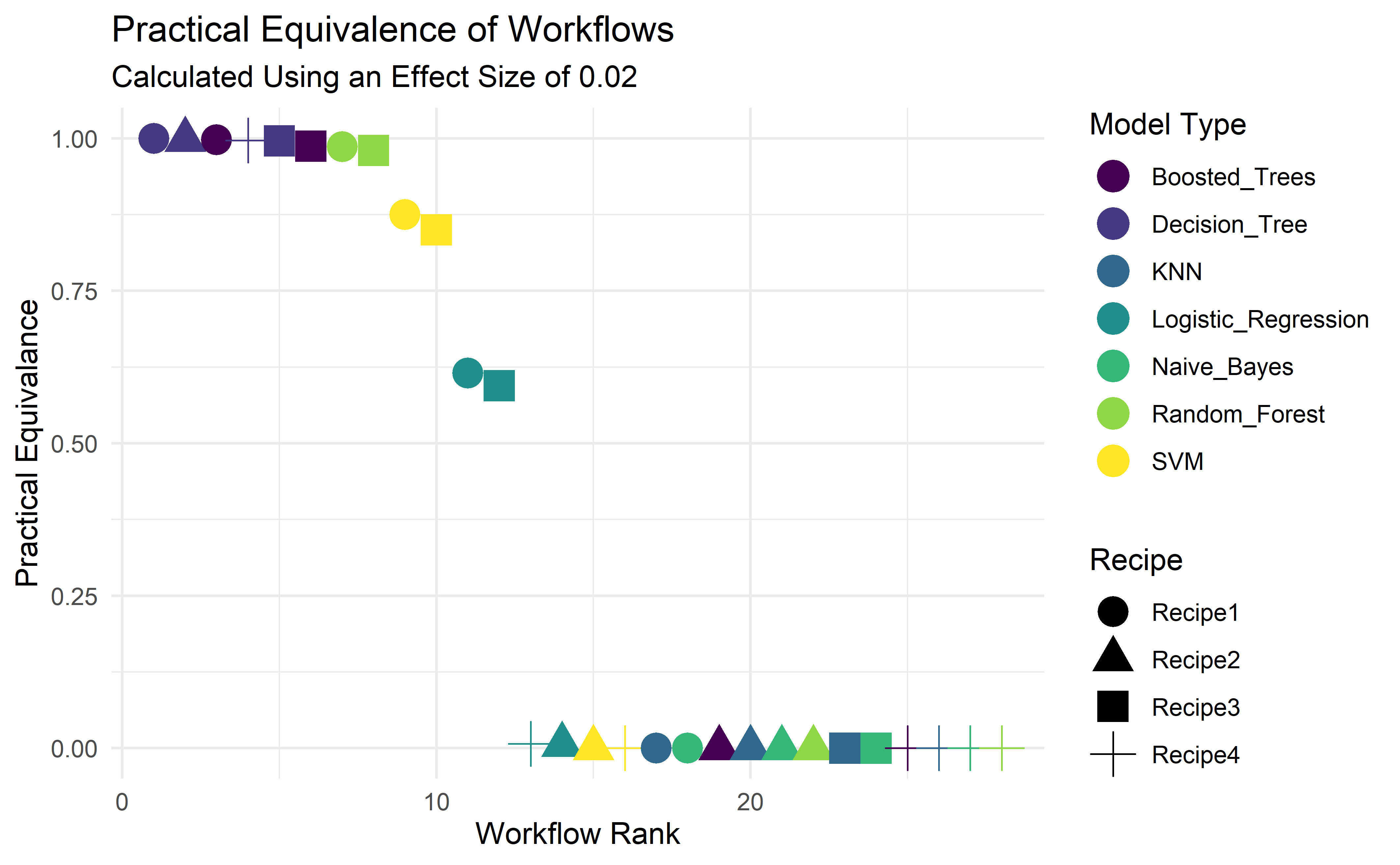
We’ve taken the data that underpins the autoplot object that conducts the ROPE (Region of Practical Equivalence) calculation, so that we can engineer and display more features. In doing so we can easily compare the each of the workflows using Recipe1_Decision_Tree as a benchmark. There are a handful of workflows that would likely perform just as well as Recipe1_Decision_Tree.
The top two candidates, Boosted_Trees and Decision_Tree sit on opposite ends of the interpretability spectrum. Boosted Trees is very much a black-box method, conversely Decision Trees are more easily understood, and in this instance provides the best result, and hence we’ll finalise our workflow on the basis of using Recipe1_Decision_Tree.
#Pull Best Performing Hyperparameter Set From workflow_map Object
best_result <- all_workflows %>%
  pull_workflow_set_result("Recipe1_Decision_Tree") %>%
  select_best(metric = "accuracy")
#Finalise Workflow Object With Best Parameters
dt_wf <- all_workflows %>%
pull_workflow("Recipe1_Decision_Tree") %>%
finalize_workflow(best_result)#Fit Workflow Object to Training Data and Predict Using Test Dataset
dt_res <-
dt_wf %>%
fit(training(loan_split)) %>%
predict(new_data = testing(loan_split)) %>%
bind_cols(loan_test) %>%
mutate(.pred_class = fct_infreq(.pred_class),
Loan_Status = fct_infreq(Loan_Status))#Calculate Accuracy of Prediction
accuracy(dt_res, truth = Loan_Status, estimate = .pred_class)

Our finalised model has managed to generate a very strong result, 84.68% accurate on the test dataset. Model is generally performing well on predicting approvals for loans that were granted. However model is approving loans that were decided against by the bank. This is a curious case, obviously more loans a bank offers means higher potential for revenue, at a higher risk exposure. This indicates the dataset contains some inconsistencies that the model is not able to fully distinguish and has been ‘confused’ based on observations in the training set.
This presents an argument for model interpretability, in this example we cannot generate more data, so how do we know the basis by which the predictions have been made?
#Fit and Extract Fit from Workflow Object
dt_wf_fit <-
  dt_wf %>%
  fit(training(loan_split))
dt_fit <-
dt_wf_fit %>%
pull_workflow_fit()#Generate Decision Tree Plot Using rpart.plot package
rpart.plot::rpart.plot(dt_fit$fit)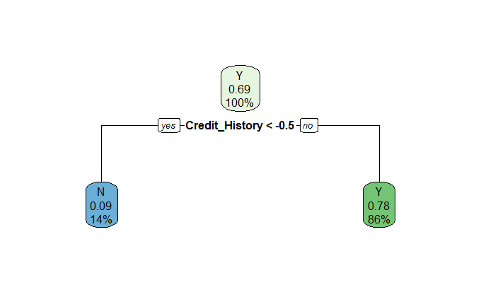
As our model is simple enough to visualise and understand, a tree plot suffices.
Immediately we observe that the decision has been based solely on the presence of a Credit History. The model is also erring on the side of providing applicants with an unknown Credit_History (= 0), and denying applicants without one (Credit_History = -1). The inconsistencies noted above are evident, not everyone with a credit history is granted a loan, but it certainly helps.
Conclusion
You return to your CDO and explain your findings. They’re impressed with the accuracy result, but now the business has to weigh up the risk of default permitting applications with unknown credit histories, and the potential revenue that it might otherwise generate.
This article has sought to explain the power of workflow_sets within the Tidymodels ecosystem. Furthermore, we’ve explored the "No Free Lunch" theorem, that no one model can be said to be better or best, and hence why it is best practice to screen many models. The types of models that respond well are also dependant on the feature engineering that is carried out.
Thank you for reading my second publication. If you’re interested in Tidymodels, I published an introductory project explaining each of the core packages when building a regression model.
Would like to acknowledge the wonderful work of Julie Slige and Max Kuhn for their ongoing efforts in developing the Tidymodels ecosystem. Their in-progress book can be viewed https://www.tmwr.org/, which has been instrumental in building my understanding.


