Data for Change

Snowpack metrics are incredibly important to understanding our climate and planning for drinking water supplies. In the Western United States, roughly 75% of drinking water comes from annual snow melt according to the USGS. While snowpack is extremely important to many parts of the world, measuring snowpack is a difficult task. Especially when it comes to understanding how snow is changing over very large swaths of land in the arctic.
Snow is very spatially variable and its structure is influenced by many factors, meaning we can’t just measure one spot and assume the surrounding area is similar. This sounds like a great task for satellites, right? We want to study something visible from space that we have trouble measuring from the ground; the problem is that in order to measure how much water is stored in snow, we need to know the depth and density. It is useful to know when an area is covered or not covered, but we can’t determine how much snow is in a given area without understanding how deep and dense the snowpack is in varying areas. Luckily there are interesting ways to leverage passive microwave imagery to obtain a proxy variable for snow water equivalent or SWE. In this post we will walk through how SWE is traditionally measured and how we can use satellites to measure SWE over large areas that wouldn’t otherwise be possible to measure.
This article is meant to introduce anyone interested in Data Science and python to an interesting remote sensing topic and a challenging dataset. There is a decent amount of background information before I dive into the Python, so get comfortable, make a cup of coffee/tea, and let’s learn about measuring snowpack with satellite data.
Fresh Water is Limited
Many people don’t realize how limited fresh water is on Earth, and much of our fresh water reserves are stored in snow and ice. In fact, only 2.5 percent of the water on Earth is freshwater. Of that 2.5 percent, only one percent is on the Earth’s surface! Even further, of the one percent on the surface, 69 percent of it is frozen ground. The takeaway here is that a massive portion of our available fresh water exists in a frozen state and is not immediately available to humans for drinking. It is also notable that the glaciers, which account for a massive portion of the Earth’s fresh water deposits, are melting rapidly.

How We Study Snowpack
Most weather stations are located in cities and airports. Getting accurate measurements of snowpack can be quite difficult when large quantities of snow tend to fall in remote and high alpine environments. There have been several methods developed to measure snow depth, but our options remain relatively slim.
SNOTEL Sites
In areas that are of high interest and are somewhat accessible on foot we measure snowpack with something called a SNOTEL site. SNOTEL is an acronym for SNOpack TELemetry, which is essentially just a remote weather station that transmits data wirelessly. There are around 700 SNOTEL sites in the United States. Below is a map of the SNOTEL sites in Colorado using Mapbox so that you can see how SNOTEL sites are positioned in and around water basins.
The primary focus of SNOTEL sites is to measure the depth of snow and estimate the amount of water stored in that body of snow, which is referred to as snow water equivalence (SWE). There are multiple sensors that can be found at SNOTEL sites. All sites use a snow pillow to measure SWE; a snow pillow consists of a bladder full of water and antifreeze that measures the pressure exerted by the snow above it. Many sites also have a snow depth sensor that shoots a beam at the snow and measures the amount of time it takes for the light to reflect back. Depth sensors can be somewhat temperamental since snow is very structurally inconsistent; the varying structure leads to unpredictable behavior with light reflection, which we will discuss more when measuring SWE with satellites.
Overall SNOTEL sites do a great job estimating snowpack for us. They are small, which means they can be set up in remote areas and require minimal maintenance during the winter when they may be inaccessible. However they are expensive to run and maintain indefinitely, and they have to be in somewhat tight networks to get a good understanding of snowpack over a certain spatial extent. Snow is incredibly spatially variable, which means there can be a lot of snow at a SNOTEL site but just a few hundred meters away could be very different.
Leverage Satellites
My first internship as an undergrad was working as a research assistant for a professor of Geospatial Statistics. In our first meeting he sat down and said that he had an idea to use a newly resampled passive microwave dataset that he thought we could leverage to analyze snowpack at much larger spatial extents than Snotel sites. There had been past research done showing the efficacy of using passive microwave data to create a proxy variable for snow depth, which I’ll explain below, but there hadn’t been any major use of the newly resampled data that reduced the length of each pixel from 25km to 6.25km.
MEaSUREs Data
MEaSUREs is NASA’s Making Earth System Data Records for Use in Research Environments program. The National Snow and Ice Data Center (NSIDC) archives and distributes quite a lot of data from MEaSUREs projects that relate to the cryosphere – parts of the Earth’s surface where water is frozen solid. The particular data set we are interested in is the MEaSUREs Calibrated Enhanced-Resolution Passive Microwave Daily EASE-Grid 2.0 Brightness Temperature Earth System Data Records. The abbreviation for this data set is MEaSUREs CEBT, much better.
Brightness temperature is the measurement of the radiance of the microwave radiation emitted from the Earth. Brightness temperature is measured with passive microwave sensors and is used to derive wind, vapor, rain, snow, and cloud products at various frequencies. Using passive microwave radiation measurements can have major advantages like being able to see through clouds during the day or night. The primary downside of measuring passive microwave radiation is that the energy level is low; the consequence of low energy is that we have to measure relatively large regions to obtain enough information, which reduces the resolution. Despite resolution challenges, passive microwave observations provide one of the most complete records of snowpack and sea ice dating back to the 1980’s.
We focus on this data set because measuring the 19Ghz and 37Ghz brightness temperature bands using passive microwave sensors is one of the only known ways to remotely sense snow mass. When we examine a body of snow, most of the radiation emitted originates from the ground below. Any scattering that is observed is primarily caused by the snowpack sitting on the surface. We focus on the 19 and 37Ghz wavelengths because the radiation scattering that occurs is frequency dependent. As snow accumulates there is a measurable change in the brightness temperature of each wavelength; since snow scatters the 37Ghz band more than the 19Ghz, the two bands begin to diverge quickly. This difference can then be used to find a proxy variable for SWE, which we can see in the plot below.
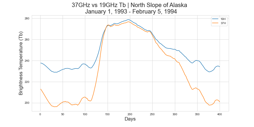
This plot depicts the brightness temperature values for both wavelengths of a single pixel over the course of a year in Alaska, starting in January. We can clearly see the summer months in the middle where the two wavelengths have no scattering from snowpack. Then we can see how the two values begin to drop and diverge as snow accumulates. That difference is a rough estimate of how much water is stored in the snowpack of this pixel.
Obtaining Our Data

The full MEaSUREs CETB dataset is 65TB! Luckily we only need a small portion of the overall data, however downloading full Northern Hemisphere imagery for a 20 year time series can still easily take over 200GB of space. To address this issue, I wrote a Python library that scrapes imagery and then geographically subsets the imagery every 10GB. This means we can choose a bounding box of coordinates and throw away all of the excess data as we go, which massively reduces file sizes. Using this subset of Alaska shown above a daily time series from 1993 to 2016 is roughly 500MB, which is much better than my 90Gb complete Northern Hemisphere time series.
It takes quite a while to download this dataset, so start with a much shorter time series if you are looking to play around with the data.
Cleaning Our Data
I mentioned earlier that our data is messy, and it is. There are issues with missing values and erroneous spikes. Here is a timeseries of a single pixel where you can clearly see two instant spikes in SWE values that instantly dropped back down.

These kinds of spikes are present randomly throughout the data and have to be removed. You will also notice that there is a lot of small variance in the data, which we also need to smooth out; remoting sensing data tends to have a lot of noise and smoothing is very common practice. The basic cleaning steps I follow to address these issues are:
- Throw away erroneous values
- Forward fill all missing values
- Apply a Savitzky-Golay (Sav-Gol) filter for smoothing
- Drop values below 3mm to 0mm
I have already written functions inside of SWEpy to handle all of these steps:
Sav-Gol filters work quite well for smoothing data that has a lot of small fluctuations, like our SWE curve. A Sav-Gol filter functions like a moving average, except instead of taking the mean at each step it fits a polynomial to the points in the window. The user simply sets the width of the window and the order of the polynomial to use.
Here is an example of how the imagery looks before and after smoothing for a single pixel in our study area:

The final curve isn’t bad. It does a decent job at preserving the overall shape so that we can more easily derive metrics like max SWE, initial zero SWE date, and total integrated seasonal SWE. A metric I am particularly interested in is the initial zero SWE date, which is the first day that zero SWE was recorded. Understanding this can help determine if snow is melting off of surfaces earlier in the year than it did in the past.
Visualizing SWE Over Alaska
Now that we have downloaded and processed our time series we can finally take a look at it!
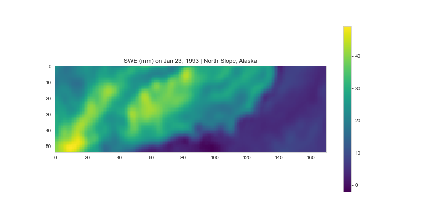
You will notice that the mountain range and land/ocean boundary are pretty similar in shape to the Google Earth image above, which means we have the right data. I think it’s interesting that we can quite easily see the coastline, even though it is likely frozen, since the radiation emitted from the ground is so different than that emitted from the water.
Seasonal Change
Our study area accumulates quite a lot of snow in the winter. To visualize this change we can plot the SWE in the study area during each season as seen below:

It isn’t ideal to have such a wide scale on all four of these images, but the changes here are interesting. In the Summer image we can see the land has near zero SWE, and due to the high temperature of the ocean it has negative SWE values. In the Winter we can see a fairly significant amount of snow has fallen on land and the ocean has likely changed significantly in temperature. There could be sea ice as well since this image is from 1993. In the Spring even though a lot of the snow has melted, the ocean is still quite cool. So in the course of one year our study area undergoes a significant amount of change!
Change Over Time
The best part of having a relatively long time series of data is being able to look at change over time. Naturally, we want to understand if snowpack has changed between the 90’s and today. There are a lot of ways to look at this problem and in this post I’m going to focus on some basic yet informative metrics.
Total Seasonal SWE Accumulation
One of my favorite metrics to look at with snowpack is how much snow accumulated that season. We can find this by integrating our curve since the area under the curve is equal to the total seasonal SWE accumulation. We have already applied a Sav-Gol filter to smooth the curve, so we can use Numpy or Scipy to find the area under the curve.
Before we can find the area we must first determine when to split each year. We can’t simply split on January 1st of each year since we are looking for seasonal SWE, which reaches zero sometime during the summer of each year. To find the summer cutoffs, I wrote a simple function that greedily searches for the start of summer for each year and stores the cutoff days.
I’m sure this is not an optimal solution to this problem, but since we only have to apply this to a single pixel time series I am okay with some inefficiency. This yields the cutoff indexes for each season of SWE that we can use to find the Integrated Total SWE for each year.
plt.plot(swe[cutoff[8]:cutoff[9],25,28])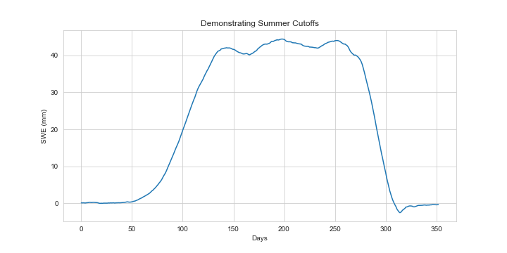
Now that we have our yearly cutoffs prepared, we can find the area under each curve to see how total SWE is changing over time. I wrote another simple function to handle this:
I know, I know. Three nested for loops, really? I did take algorithms, but sometimes it is easier to see what is happening with geospatial data if you loop instead of vectorizing. There is often a faster way to vectorize something like this with Numpy. Also, on larger data sets employing multiprocessing on chunks of the data can drastically reduce computation time. Inefficiency aside, now we have a matrix that has yearly integrated SWE on the z axis instead of daily SWE. We can use this array to visualize how SWE is changing over Alaska.


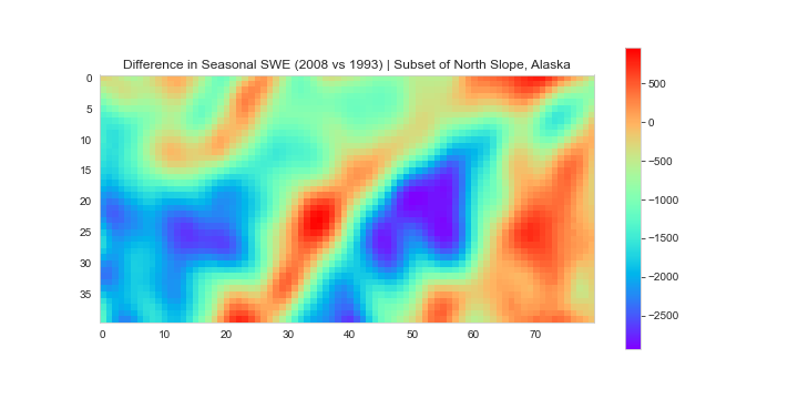
At first glance, this may not look too bad. Areas with red/orange haven’t changed much or have more snow than before, while green and blue areas have less snow in 2008 than 1993. For this subset of the North Slope, 82% of the pixels have less snowpack in 2008 than they did in 1993. This particular difference map represents ~2,979,269 mm of SWE lost, which is quite large!
More detailed analysis needs to be done to determine true change over time, but these initial results are in line with what we would probably expect to see. The severity of the change in total SWE depends on the year combinations you choose. Almost any year after 2005 paired with a year before 2005 will show less snow in this area, but 2016 was a high SWE year. A high SWE year doesn’t mean that will continue though, and variation is to be expected. Ideally we would expand the time series to include data from the 1980’s, however the older data is messier and requires more work to clean and process.
Initial Zero SWE Date
While overall snow accumulation is important, another useful metric to follow is the initial zero SWE date. This is the first day of each year that a pixel has no snow left. Tracking this over time can help show us if snow is melting earlier in the year, which has significant impacts on planning for municipal water collection. The longer an area is bare each summer can also contribute to permafrost degradation.
Luckily we already have most of the code we need to find the initial zero SWE date from our function we used to find our summer cutoff days. However, with the summer cutoff days we were able to generalize one pixel out to the entire image. With initial zero SWE date we will need to loop through each pixel’s time series individually; to speed up the processing I have employed multiprocessing with a pool, chopping the cube up spatially. I chose to show an image from a different study area in Russia because it is a good middle of the road example of the kind of change I have been seeing. I chose to compare 1993 to 2016 because 2016 had a lot of snow for a year after 2005. This made for an interesting comparison of melt dates; as you can see below, despite having similar levels of SWE pixels in 2016 are melting earlier than those in 1993.

We can see that the initial zero SWE date is changing over time. In 1993 the pixels very largely melted around day 150. However, in 2016 we can see the purple arrow point to a large portion of pixels melting earlier in the year than in 1993. The area outlined in green also shows how almost no pixels still have yet to reach zero SWE after day ~160; this means that there was no melt occurring after day ~160, which can have a significant impact on runoff behavior. It is also important to note how roughly 30% more pixels never accumulate any SWE at all in 2016 compared to 1993, which is indicated by the orange arrow.
Wrapping Up
There is so much to talk about with this data and this post just scratches the surface of what we can explore. Hopefully after reading through this you have a new understanding of how we study snowpack and how we can leverage satellites to better study snowpack at large scales. I will be writing a couple more posts working with this data since there is so much to explore and discuss.
As we saw in some of our plots, it does appear that SWE is decreasing over time, which is generally the result I have found in my time working with this data. However, there are certain regions that show increasing SWE, and it is impossible to make any claims about snowpack on the North Slope of Alaska without bringing in more data. Events like large wildfires and shifts in global weather patterns can potentially impact SWE measured with passive microwave from year to year, which means we need a more sophisticated method of measuring change over time. We will explore incorporating temperature, a vegetation index, and a Digital Elevation Model (DEM) in future posts to see if we can get a better understanding of what kind of changes are occurring.
Citations
Brodzik, M. J., D. G. Long, M. A. Hardman, A. Paget, and R. Armstrong. 2016, Updated 2020. MEaSUREs Calibrated Enhanced-Resolution Passive Microwave Daily EASE-Grid 2.0 Brightness Temperature ESDR, Version 1. Boulder, Colorado USA. NASA National Snow and Ice Data Center Distributed Active Archive Center. doi: https://doi.org/10.5067/MEASURES/CRYOSPHERE/NSIDC-0630.001. [4/25/2021]


