
Article Purpose
This is the second part of the article about Wave Data Feature Engineering. We are going to focus on the spectral features. Have you got any thoughts to add? Feel free to share!
This article is part of the series Understanding Predictive Maintenance.
Check the whole series in this link. Ensure you don’t miss out on new articles by following me. All images without captions were created by me.
Frequency-Domain Features
Transitioning to the frequency domain, we employ techniques like the Fast Fourier Transform (FFT) to convert time-domain signals. Extracted features include dominant frequency, spectral entropy, and spectral kurtosis. Power Spectral Density (PSD) and Harmonic Ratios offer insights into power distribution and harmonic relationships.
FFT (Fast Fourier Transform) Convert the time-domain signal to the frequency domain. Extract features from the resulting spectrum, such asdominant frequency,spectral entropy, andspectral kurtosis.Power Spectral Density (PSD)Describes how the power of a signal is distributed over frequency.
Plan for the next article
- Wavelet Transform
- Demodulation
- Recurrence Quantification Analysis (RQA)
Create the signal for experiments
I will use exactly the same as in the previous part:
Understanding Predictive Maintenance – Wave Data: Feature Engineering (Part 1)
Let’s generate the signal:
# Parameters
duration = 20         # seconds
sampling_rate = 20    # Hz
frequency = 5         # Hz (vibration frequency)
amplitude = 1.0       # Min Max range
noise_level = 0.3     # Noise factor to increase reality
max_wear = 1          # Maximum wear before reset
wear_threshold = 0.5  # Wear threshold for reset

# Generate synthetic vibration signal with wear and threshold
time, vibration_signal = generate_vibration_signal(duration, sampling_rate,
 frequency, amplitude, noise_level, max_wear, wear_threshold)
Fast Fourier Transform (FFT) and Short-Time Fourier Transform (STFT)
Signal Representation
Let’s start with our signal, which is essentially a series of data points representing how the signal changes over time. This could be a sound wave, a sequence of numbers, or any other data that varies with time.
Discrete Fourier Transform (DFT)
The FFT is a more efficient way of computing something called the Discrete Fourier Transform (DFT). The DFT takes our signal and expresses it as a sum of sinusoidal functions, each representing a different frequency component. This is where the magic happens.
Divide and Conquer
Instead of directly computing the DFT for the entire signal, FFT takes advantage of the fact that a DFT of any composite signal can be expressed as the combination of DFTs of its subparts. It divides the signal into smaller sections, computes the DFT for each section, and then combines them.
Butterfly Operation
The magic of FFT lies in a process called the butterfly operation. It’s like a dance move where the computed frequencies are paired up and combined in a specific way. This happens recursively until we have the final frequency components of the entire signal.
Efficiency Boost
The key to FFT's speed is its ability to dramatically reduce the number of computations needed compared to the straightforward DFT approach. By exploiting the symmetries and patterns in the signal, FFT efficiently calculates the frequency components.
Time for code
Now we can apply the theory into practice in simple code lines:
import numpy as np

# Apply FFT to the signal
fft_result = np.fft.fft(vibration_signal)

# This very important part, let`s investigate it more in depth
frequencies = np.fft.fftfreq(len(fft_result), 1/sampling_rate)
len(fft_result) This is the length of the FFT result, which is essentially the number of points in the frequency domain. The FFT operation transforms a time-domain signal into a frequency-domain signal and len(fft_result) gives you the number of frequency bins.
1/sampling_rate This is the inverse of the sampling rate sampling_rate, representing the time interval between samples in the original time-domain signal. The sampling rate is the number of samples per second.
np.fft.fftfreq() This function generates the frequencies corresponding to the FFT result. It takes two parameters. The first one is the length of the result len(fft_result), and the second one is the sampling interval 1/sampling_rate. It returns an array of frequencies.
But do not worry. Using these two lines, the whole ‘magic’ will happen
# Plot the time-domain signal
plt.subplot(2, 1, 1)
plt.plot(t, vibration_signal)
plt.title('Vibration Signal with Wear')
plt.xlabel('Time (s)')
plt.ylabel('Amplitude')

# Plot the frequency-domain signal (FFT)
plt.subplot(2, 1, 2)
plt.plot(frequencies, np.abs(fft_result))
plt.title('Frequency Domain Signal (FFT)')
plt.xlabel('Frequency (Hz)')
plt.ylabel('Amplitude Spectrum')

plt.tight_layout()
plt.show()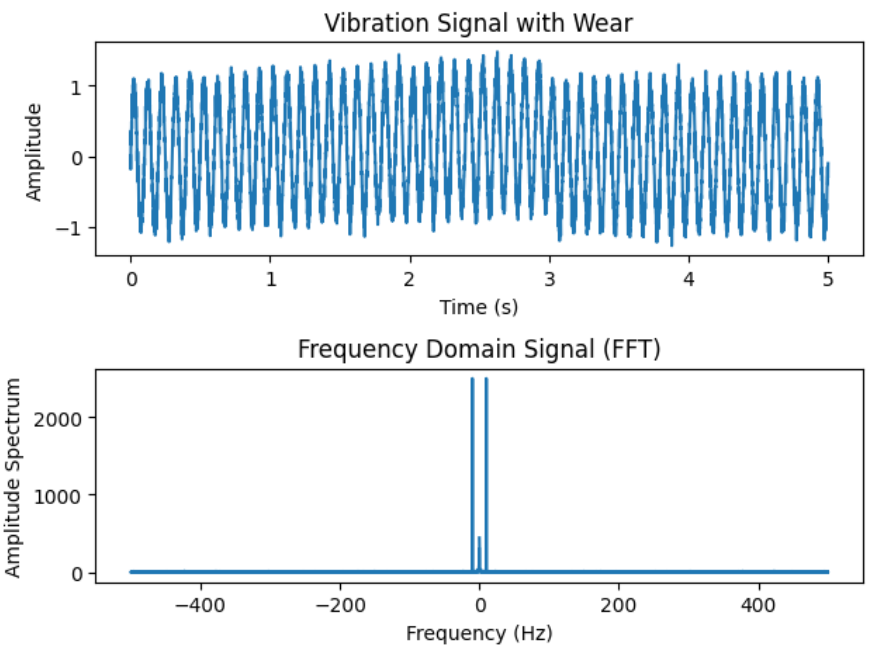
In the plot, we notice a central signal at 0, flanked by two mirrored symmetrical signals on the positive and negative sides. This indicates that our signal is comprised of a single distinct wave. Before delving into experiments, let’s first explore the concept of symmetry, and afterward, we can conduct experiments with various signals.
Behind the scenes – FFT symmetry
What is happening on the backstage? We have some math and theoretical concepts. Let’s make it easy.
In many real-world scenarios, signals are composed of real numbers. In the time domain, these signals can be represented as a sequence of values. When you take the FFT of a real-valued signal, the resulting frequency spectrum is symmetric.
Complex conjugate pairs the symmetry comes from the fact that the FFT involves complex numbers. For every positive frequency component, there is a corresponding negative frequency component with the same magnitude. These pairs of frequencies are complex conjugates of each other.
Mirrored information The positive frequencies represent the information about how the signal oscillates in one direction, while the negative frequencies represent the same information but in the opposite direction. The FFT captures both directions, and that’s why the plot looks symmetrical
In summary, the symmetry in the FFT is a consequence of the mathematical properties of real-valued signals and complex numbers in the context of the FFT.
Let’s start the next experiments
Now we understand the basic concepts of the FFT. Let’s simulate 2 signals with different parameters connected together
We will generate a second similar signal we will only focus on Frequency and amplitude:
# First Signal
frequency = 10
amplitude = 1

#Second Signal
frequency = 20
amplitude = 1
Now let’s create a combined signal and plot:
t2, vibration_signal_2 = generate_vibration_signal(duration, sampling_rate,
   frequency, amplitude, noise_level, max_wear, wear_threshold)

# Combine the signals just simply add them :)
combined_signal = vibration_signal + vibration_signal_2

plt.plot(t1, combined_signal, label='Signal 1')
plt.title('Combined Signals')
plt.xlabel('Time (s)')
plt.ylabel('Amplitude')
plt.show()
Now let’s make FFT and plot results:
# Apply FFT to the combined signal
fft_result = np.fft.fft(combined_signal)
frequencies = np.fft.fftfreq(len(fft_result), 1/sampling_rate)

# Plot the frequency-domain signal (FFT)
plt.plot(frequencies, np.abs(fft_result))
plt.title('Frequency Domain Signal (FFT)')
plt.xlabel('Frequency (Hz)')
plt.ylabel('Amplitude Spectrum')
plt.show()
Now you can see we have the same amplitude height but 2 more signals equally offset. First signal = 10Hz Second signal = 20Hz
The X-axis position is adjusted for signal frequency. Let`s introduce the third signal = 100 Hz and plot.
frequency = 100
amplitude = 1
t3, vibration_signal_3 = generate_vibration_signal(duration, sampling_rate,
   frequency, amplitude, noise_level, max_wear, wear_threshold)

# Combine the signals just simply add them :)
combined_signal = vibration_signal + vibration_signal_2 + vibration_signal_3

frequency = 150 # Just for make offset, now you know how it works
amplitude = 2
t4, vibration_signal_4 = generate_vibration_signal(duration, sampling_rate,
    frequency, amplitude, noise_level, max_wear, wear_threshold)

# Combine the signals
combined_signal = vibration_signal + vibration_signal_2 +
    vibration_signal_3 +vibration_signal_4

# Apply FFT to the combined signal
fft_result = np.fft.fft(combined_signal)
frequencies = np.fft.fftfreq(len(fft_result), 1/sampling_rate)

plt.plot(frequencies, np.abs(fft_result))
plt.title('Frequency Domain Signal (FFT)')
plt.xlabel('Frequency (Hz)')
plt.ylabel('Amplitude Spectrum')

plt.tight_layout()
plt.show()
As we can see our "new" signal is now much more offset due to the higher frequency value
What will happen if we add a fourth signal with a different amplitude
Make a new signal and plot it together
frequency = 150 # Just for make offset, now you know how it works
amplitude = 2
t4, vibration_signal_4 = generate_vibration_signal(duration, sampling_rate,
    frequency, amplitude, noise_level, max_wear, wear_threshold)

# Combine the signals
combined_signal = vibration_signal + vibration_signal_2 +
    vibration_signal_3 + vibration_signal_4

# Apply FFT to the combined signal
fft_result = np.fft.fft(combined_signal)
frequencies = np.fft.fftfreq(len(fft_result), 1/sampling_rate)

plt.plot(frequencies, np.abs(fft_result))
plt.title('Frequency Domain Signal (FFT)')
plt.xlabel('Frequency (Hz)')
plt.ylabel('Amplitude Spectrum')

plt.tight_layout()
plt.show()
Now you can see our Amplitude spectrum is twice higher due to amplitude values 1 and 2
Power Spectral Density (PSD)
PSD is like taking a special snapshot of a signal and understanding how much power it has at different frequencies. It helps us see the energy distribution across the musical or vibration spectrum. We have 2 main PSD estimation methods, Welch and Barlett.
For the experiments, we will create a new combined signal just for the sake of clarity and improved visualization (not close frequency to see clear peaks)
frequency = 100
amplitude = 1
t5, vibration_signal_5 = generate_vibration_signal(duration, sampling_rate,
       frequency, amplitude, noise_level, max_wear, wear_threshold)

frequency = 200
amplitude = 1
t6, vibration_signal_6 = generate_vibration_signal(duration, sampling_rate,
       frequency, amplitude, noise_level, max_wear, wear_threshold)

frequency = 400
amplitude = 3
t7, vibration_signal_7 = generate_vibration_signal(duration, sampling_rate,
       frequency, amplitude, noise_level, max_wear, wear_threshold)

combined_signal2 = vibration_signal_5 + vibration_signal_6 + vibration_signal_7
Welch Method

def welch_method(signal, segment_size=128, overlap=64):
    f, Pxx = plt.psd(signal, NFFT=segment_size, Fs=sampling_rate, noverlap=overlap)
    plt.title('Welch Method')
    plt.xlabel('Frequency (Hz)')
    plt.ylabel('Power/Frequency (dB)')
    plt.show()
    return f, Pxx

freq_welch, P_welch = welch_method(combined_signal2)
The Welch method divides the signal into overlapping segments and averages the periodograms. This approach provides a trade-off between accuracy and computational complexity. However, it may sacrifice frequency resolution for improved variance properties.
Bartlett Method

Bartlett method is a specific case of the Welch method with no overlap between segments. While offering simplicity and reduced computational load, it shares a similar trade-off between accuracy and frequency resolution with the Welch method.
def bartlett_method(signal, segment_size=128):
    f, Pxx = plt.psd(signal, NFFT=segment_size, Fs=sampling_rate, window=np.bartlett(segment_size))
    plt.title('Bartlett Method')
    plt.xlabel('Frequency (Hz)')
    plt.ylabel('Power/Frequency (dB)')
    plt.show()
    return f, Pxx

freq_bartlett, P_bartlett = bartlett_method(combined_signal2)

The graphical explanation about the differences

Short-Time Fourier Transform (STFT) – windowing + FFT

Why it is useful in predictive maintenance?
STFT analysis enables engineers to scrutinize the frequency components of signals, such as vibrations or acoustic emissions from machinery. The distinct frequency patterns associated with various faults or abnormalities allow for the early detection of potential issues, contributing to minimizing downtime and maintenance costs.
One of the primary advantages of STFT in predictive maintenance is its ability to identify fault signatures early on. This is particularly crucial as STFT can detect low-amplitude vibrations or subtle changes in signals, providing an early warning system that allows practitioners to address issues before they escalate.
Furthermore, STFT plays a pivotal role in distinguishing between normal and anomalous frequency patterns. By establishing baseline frequency spectra through a comparison of healthy and faulty equipment, engineers can efficiently identify deviations and signal impending problems, forming the foundation for effective predictive maintenance strategies.
Let’s make some code
from scipy.signal import spectrogram

# Apply Short-Time Fourier Transform (STFT) to the combined signal
frequencies, times, Sxx = spectrogram(combined_signal, fs=sampling_rate,
nperseg=256, noverlap=128)
Woooh, just "one" line! Power of python. In this function, we have to play with 2 important parameters with funny names nperseg and noverlap.
nperseg (Number of Points per Segment).
This parameter determines the size of each time window or segment. A larger nperseg one results in better frequency resolution but poorer time resolution, and a smaller nperseg one provides better time resolution but poorer frequency resolution. In other words, it affects the trade-off between time and frequency resolution. In the example, nperseg=256 it means that each time window is 256 points long.
noverlap (Number of Overlapping Points).
This parameter controls the overlap between consecutive time windows. Overlapping windows help in capturing the dynamic changes in the signal over time. If noverlap is set to a value less than nperseg, the windows overlap. In the example, noverlap=128 means that each time window overlaps with the previous one by 128 points.
Let’s plot it
plt.pcolormesh(times, frequencies, 10 * np.log10(Sxx), shading='auto')
plt.title('Spectrogram - Combined Signal')
plt.xlabel('Time (s)')
plt.ylabel('Frequency (Hz)')
plt.show()
We have to use Sxx with basically is spectrogram output(Sxx[i, j]) We can easily spot our 4 signals combined together. The thicker the ribbon the higher the amplitude we have
Spectogram Grid (Sxx) Imagine a big grid like a piece of graph paper.
Grid Rows (up and down) Each row in the grid represents a different sound frequency, like high or low tones. Higher rows might represent high-pitched sounds, and lower rows could be for low-pitched sounds.
Grid Columns (left to right) Each column in the grid represents a different moment in time, like a snapshot. As you move from left to right, you’re looking at how the sound changes over time.
Colors in the Grid The colors in the grid tell you how loud or strong each frequency is at each moment. Bright colors might mean loud sounds and dull colors might mean quieter sounds.
What will happen if one of our signals will be much stronger?
Let’s reframe the explanation in the context of predictive maintenance and simulate a scenario where we modify the fourth signal with a significantly higher amplitude, resembling a potential fault or anomaly in the machinery.
amplitude = 20 # Increase it
t4, vibration_signal_4 = generate_vibration_signal(duration, sampling_rate,
  frequency, amplitude, noise_level, max_wear, wear_threshold)

# Combine the signals
combined_signal = vibration_signal + vibration_signal_2 +
  vibration_signal_3 + vibration_signal_4

# Apply FFT to the combined signal
fft_result = np.fft.fft(combined_signal)
frequencies = np.fft.fftfreq(len(fft_result), 1/sampling_rate)

plt.plot(frequencies, np.abs(fft_result))
plt.title('Frequency Domain Signal (FFT)')
plt.xlabel('Frequency (Hz)')
plt.ylabel('Amplitude Spectrum')

plt.tight_layout()
plt.show()
Now, observe our new signal, which is significantly dominant. This doesn’t imply that the other signals have vanished, but their presence is overshadowed by the amplitude of the prominent signal, making them appear more like noise in comparison.
from scipy.signal import spectrogram

# Apply Short-Time Fourier Transform (STFT) to the combined signal
frequencies, times, Sxx = spectrogram(combined_signal, fs=sampling_rate, nperseg=256, noverlap=128)

plt.pcolormesh(times, frequencies, 10 * np.log10(Sxx), shading='auto')
plt.title('Spectrogram - Combined Signal')
plt.xlabel('Time (s)')
plt.ylabel('Frequency (Hz)')
plt.show()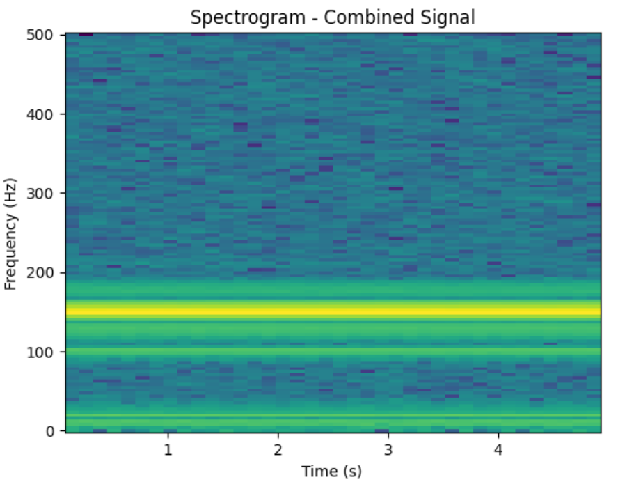
In the spectrogram results, a conspicuous and intense line emerges, indicating a potential precursor to future machinery failure. In normal operational conditions, our machinery produces a background spectrum. However, as wear and tear progress or a component is on the verge of failure, deviations from this normal state become noticeable. To delve deeper into this, we might explore training a Convolutional Neural Network (CNN) to analyze these spectral patterns and identify distinctive signatures associated with impending failures. After the articles about Feature Engineering, I am going to start the modeling series.
This is the end of part 2 of the wave data feature engineering. In the next article, I am going to cover.
- Wavelet Transform
- Demodulation
- Recurrence Quantification Analysis (RQA)
This article is part of the series Understanding Predictive Maintenance. Due to your great feedback and recommendation, I have a plan to make the book. If there is something that is worth extending or including just let me know. I am considering all your feedback.
Check the whole series in this link. Ensure you don’t miss out on new articles by following me.


