Data Storytelling
-

A deep dive into the ways data can be used to misinform the masses
9 min read -
Simple methods to replace cluttered bar charts with crisp, reader-friendly visuals.
14 min read -

Showcasing Soaring Wildfire Counts With Streamlit and Python: A Powerful Approach
Data VisualizationAnalyzing historical wildfire trends in Canada with public data
13 min read -

Discover the #1 strategy to handle skyscraper bars in your charts
8 min read -

Is there ever a good reason for starting a bar chart above zero?
10 min read -

To rotate or not rotate? To truncate or to not truncate?
10 min read -

And it is not always simply ordering by highest to lowest
10 min read -
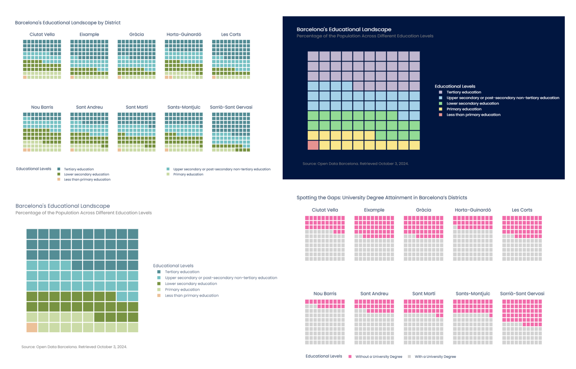
Learn how to create custom waffle charts in Python using Plotly for data visualization
13 min read -

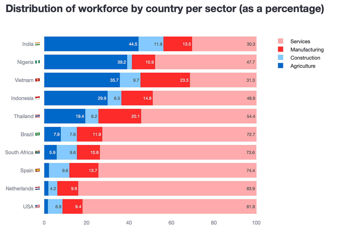
Do technicolour bars really help make a story clear?
13 min read