Here, I will try my best to break down statistical concepts into various ways that can be easily understood, at the same time serve as summary notes during my journey of learning.
Population V.S The Sample
Many a times we conduct surveys on a small sample size simply because it is unfeasible to survey an entire population. This sample then allows us to draw inferences about the actual population. The study of statistics largely answers this question: To what confidence can I trust that the sample results speak the truth about the population?
This method of making generalizations about a population is called inferential statistics. Before we get to that, let us recap some basic descriptive statistics we would have come across in our earlier schooling days.
Descriptive Statistics
The mean, median and mode are familiar ways to find the average value within a dataset. Here are some other ways to better describe and visualize our dataset:
![Equation [1]](https://towardsdatascience.com/wp-content/uploads/2020/11/1QDOdy6VfWtbS74Lx8K84eQ.png)
The arithmetic mean is obtained by dividing the sum of all numbers in the dataset by the count of numbers in the dataset. A common example would be to determine the average height of a student in a class.
![Equation [2]](https://towardsdatascience.com/wp-content/uploads/2020/11/1qBvHqWlCsc8QjOtS2u33Cw.png)
Although less intuitive than the arithmetic mean, the geometric mean can be easily related to when working with percentages. For example, to determine the average return of an investment over a duration of time.
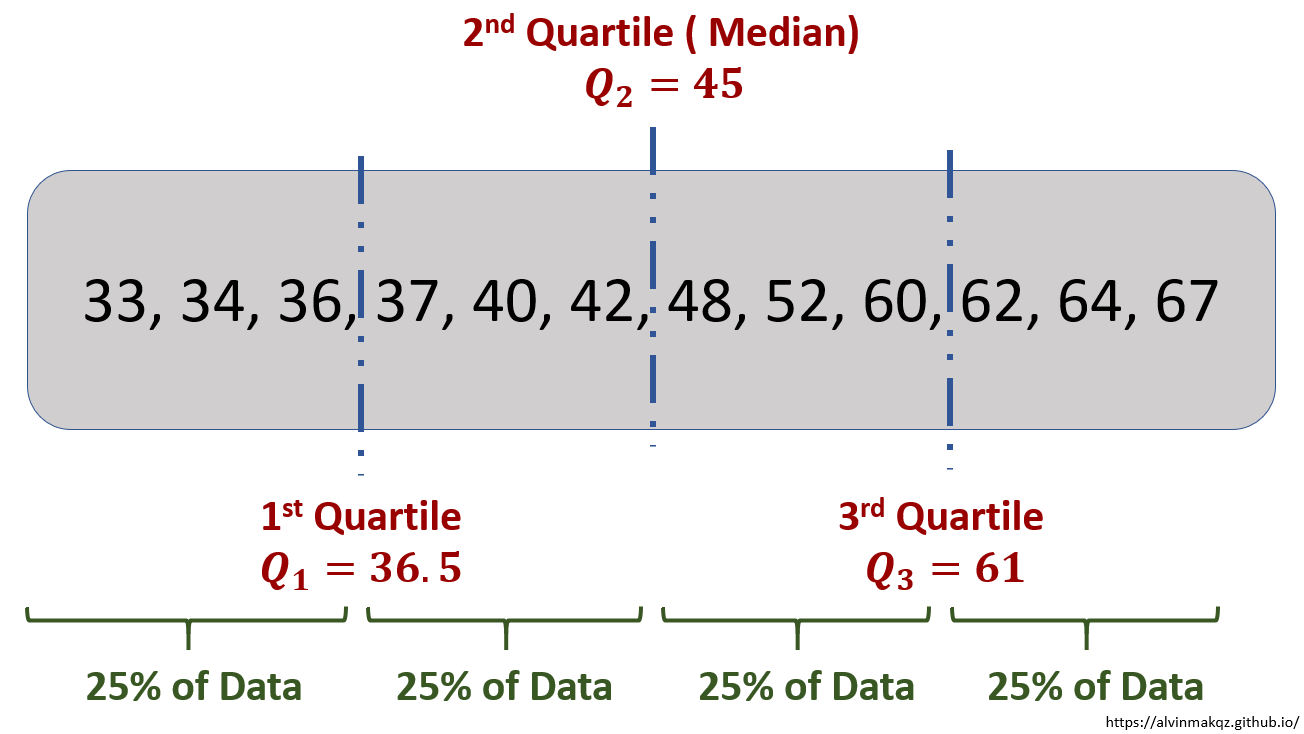
The mode of a dataset is the value which appears the most often, while the median is the middle number in an ordered list of numbers. Sharing a similar concept as the median, quartiles break up an ordered list of numbers into four equal parts, with the desired quartile sitting at the break locations.
To better visualize the spread of numbers within a dataset, a box plot can be used to quickly reveal the max, min, and quartile locations. Varying shapes of the boxplot reveal skewness within the data. Box plots are also useful in identifying if outliers are present.

The range of a dataset provides a very basic overview of its variability – the degree to which individual points are distributed around the mean. A better way to measure variability would be to calculate its variance and standard deviation.
![Equation [3]](https://towardsdatascience.com/wp-content/uploads/2020/11/1BoXIMeLjHmAhdyhe4nwM9A.png)
![Equation [4]](https://towardsdatascience.com/wp-content/uploads/2020/11/17HTquLNbs8GSt4IYdK00yA.png)
While these equations might look intimidating, the variance simply takes the average of the difference between each data point and the mean. The differences are squared to eliminate effects from positive and negative values. Since the variance is of a much larger magnitude now (due to the squared function), the standard deviation takes the square root of the variance such that it becomes "relatable" to the dataset.

As seen from the example above, the variance and standard deviation calculated are 146.58 and 12.11 respectively. Comparing these two values to the original dataset values, a spread of ±12.11 about the mean can be considered more "relatable" compared to the variance value of 146.58.
Inferential Statistics
Now that we have recapped to some extent descriptive statistics, let us revisit the question that was asked earlier on: To what confidence can I trust that the sample results speak the truth about the population?
Suppose we want to determine the average weight of a newborn baby. By collecting a sample of weights from 8 babies, the sample mean is found to be 3.2kg. Another sample consisting of 20 babies reveals a sample mean of 3.4kg. Intuitively, which mean should we trust more?
![Equation [5]](https://towardsdatascience.com/wp-content/uploads/2020/11/1bt_SrNwPePqI1g9sWD0EPg.png)
This example illustrates the concept of errors in estimates – What should be our "best guess" when determining a population parameter. From equation[5], we can see that when the sample size N increases, the standard error decreases, where s is the standard deviation of the sample. This gives some indication of how much variation there could be in the sample mean.
Now knowing there is also variation across and within samples, a point estimate i.e. population parameter taking a specific value does not seem like a feasible option. Instead, a Confidence Interval is introduced, which is a range of numbers within which the population parameter is believed to fall into.
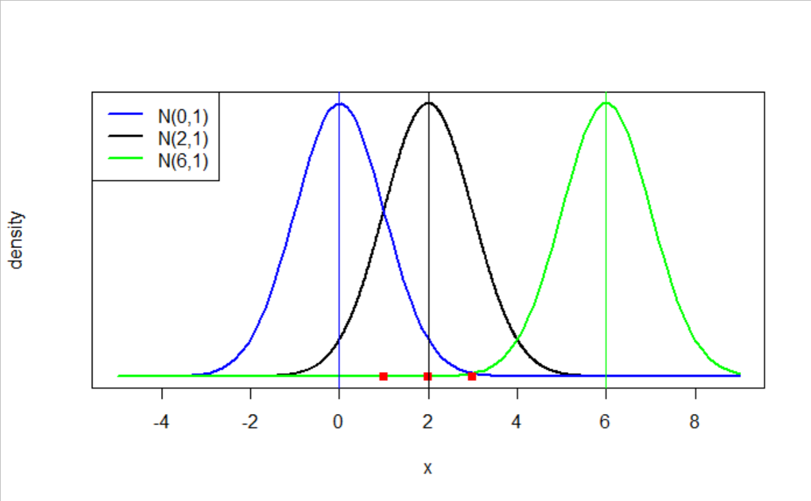
A normal distribution, shaped like a bell curve, is commonly used to determine the confidence interval. This is because of the unique observation brought about by the Central Limit Theorem (CLT). The CLT states that if the population has a finite mean and standard deviation, when sufficiently large random samples are taken from it with replacement, the distribution of the sample means will be approximately normally distributed.
It is important to note that we may not necessarily know what distribution the population data follows. Similarly, each sample taken will follow an unknown random distribution. However, when a sufficiently large number of samples are drawn, their averages will follow a Normal Distribution due to the Central Limit Theorem. The diagram below illustrates this point.
From the normal distribution graph created, we can visualize where the estimated population mean lies. The standard deviation is calculated by considering each individual sample mean as a data point. However, if there is only one sample, and the distribution is assumed to be normal, the standard deviation can be estimated to be the standard error of the mean, per Equation[5].
To construct the confidence interval we need to first transform the normal distribution into a z-distribution, otherwise known as standardizing the normal distribution. In doing so, the distribution will eventually take a mean of 0 and a standard deviation of 1.
![Equation[6]](https://towardsdatascience.com/wp-content/uploads/2020/11/1KebsTFiolr2o4y0TkkV6ew.png)
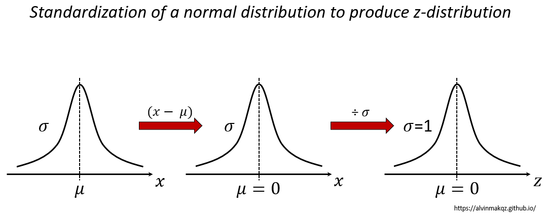
In a normal distribution, the mean, median and modes are equal with the curve symmetrical about the mean. Total area under the curve is 1, which signifies 100% probability. Z- scores are values along the z axis which correspond to the number of standard deviations from the mean. At varying z-scores, the z-table identifies the total area bounded by these scores. The area also represents the percentage of observations that will lie within this interval, which is sometimes called the p-value. Therefore, we can estimate a statistic with probabilistic confidence represented as confidence intervals.

If the sample size n is small (< 30), and/or the population standard deviation is unknown, we use a t-distribution instead. Also having a bell shaped curve, the t-distribution has a lower peak and fatter tails compared to a z-distribution, resulting in a more conservative confidence interval given the same significance level. We can think of this as a way of penalizing the estimate since less reliable information is provided.

Instead of referring to the z-table, the t-table is used instead. One point to note when using the t-table is that the degrees of freedom (D.O.F) is used instead, where D.O.F = n -1. The D.O.F refers to the numbers of values in a final calculation that are free to vary. In this case, the D.O.F = n -1 because the last term in n has to be a fixed value given a known sample mean and sample standard deviation.
The concept of confidence intervals and significance levels is used extensively in Statistics and machine learning techniques. While it does provide a range of estimates for the population parameter at a relatively high confidence, there exists a chance of error where the mean actually lies outside of the stated confidence interval. More will be covered in my next post on Hypothesis Testing. Stay tuned!